Us City Branding
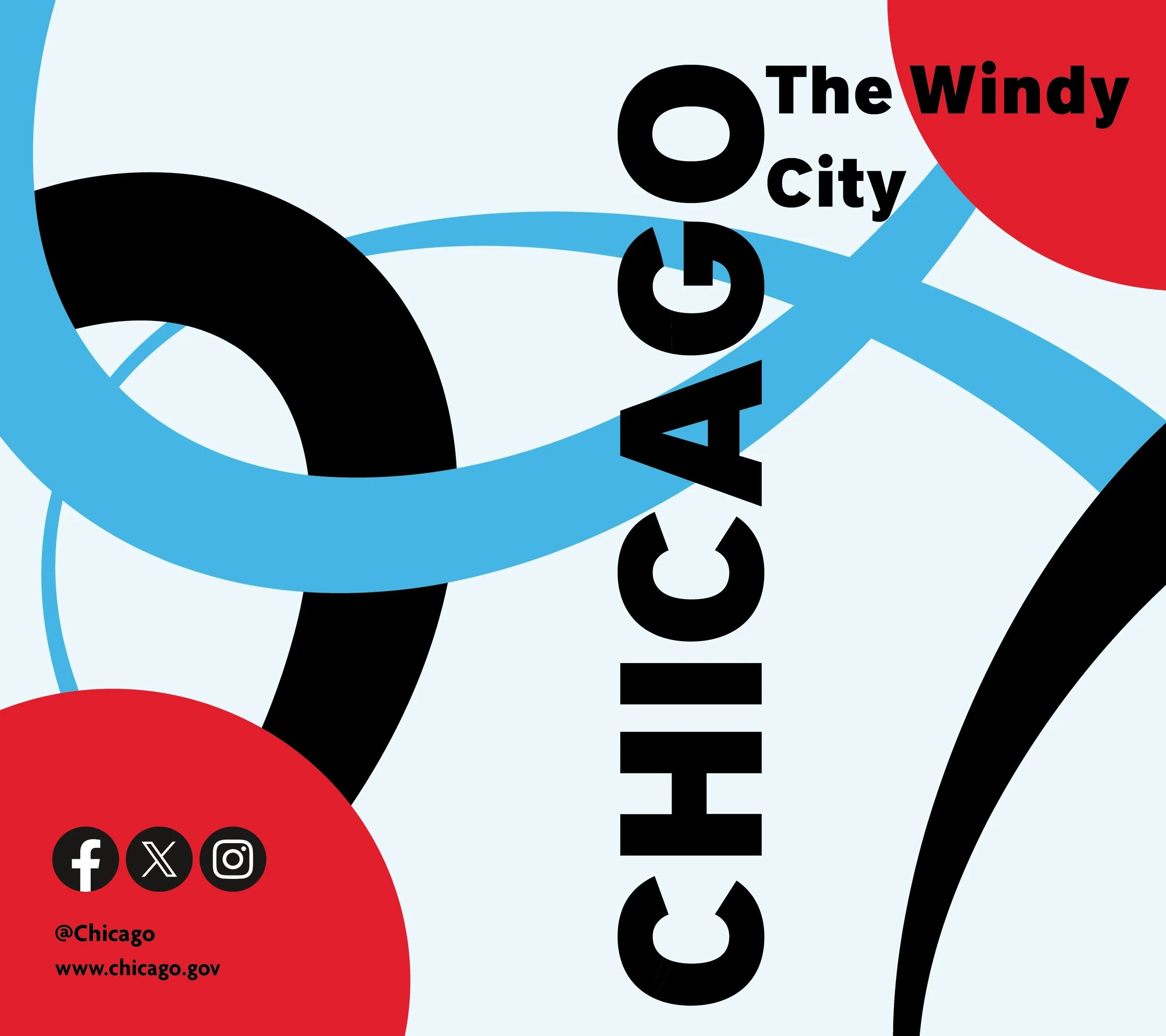
The city of Chicago is well known for its diversity. The rebranding effort aimed to create a brand that speaks to the wide range of different people and communities that occupy the location. The logo for the city acts as an anchor for the rest of the brand. The two ovals represent the vast contrast in people who come together, and the circle represents the endpoint of people's destination. The blue loop is shown throughout the brand as an illustrative container and is displayed in various locations depending on whether the loop is to add a creative feel or a professional one. The rest of the brand holds onto the idea of being professional and neutral, but also incorporates a well-balanced creative element that highlights important information and creates unity to the brand.